Excel Pivot tables and graphs
Grouping and aggregate functions in Excel aka Pivot Tables
Excel can also implement something very similar to SQL’s GROUP BY and Aggregate functions. The feature that accomplishes this is called pivot tables.
Here’s a query that we implemented in SQL, working to find the performance with the highest revenue:
SELECT performances.id,
       ANY_VALUE(bands.name),
       ANY_VALUE(performances.start),
       SUM(tickets.price) as revenue
FROM tickets
  JOIN performances
    ON tickets.performance_id = performances.id
  JOIN bands
    ON performances.band_id = bands.id
GROUP BY performances.id
ORDER BY revenue DESC
To replicate this in Excel we first need to get the relevant data. SQL does not export the table names, so I include them in aliases.
SELECT tickets.ticketnum AS "ticket_num",
       tickets.price AS "ticket_price",
       performances.id AS "performance_id",
       performances.start AS "performance_start",
       bands.name AS "band_name"
FROM tickets
  JOIN performances
    ON tickets.performance_id = performances.id
  JOIN bands
    ON performances.band_id = bands.id
I have created an Excel file with the results of that query that you should download.
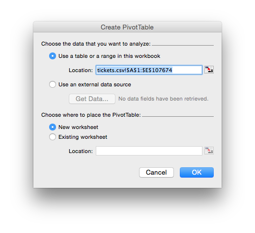
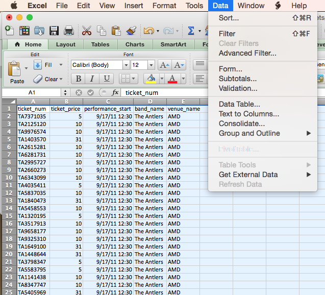
In Excel choose Data -> Pivot Table. Some versions may have this located somewhere other than the data table, so just look for Pivot Table. That brings up a window asking where you’d like to place it, you should choose “New Worksheet”:
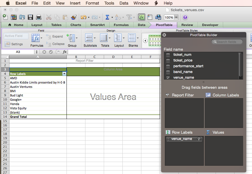
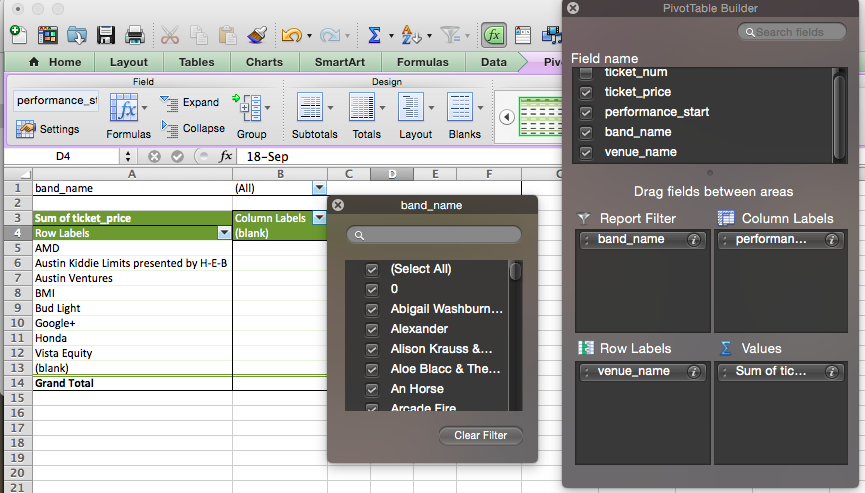
On choosing that a new worksheet will be added and a blank pivot table inserted. On my version of excel there is a “hovering” black window titled “PivotTable Builder” which lets me drop columns into different places. I have to be careful not to lose that window (it doesn’t seem to show up as a window in Excel’s window menu and seems to get lost behind other files.)
The PivotTable builder window has the columns from the imported csv in the top. We can drag these into the four different locations. To implement our results from SQL we drag our GROUP BY variable into “Row Labels”. We can now see the distinct values of performances.id on the left.
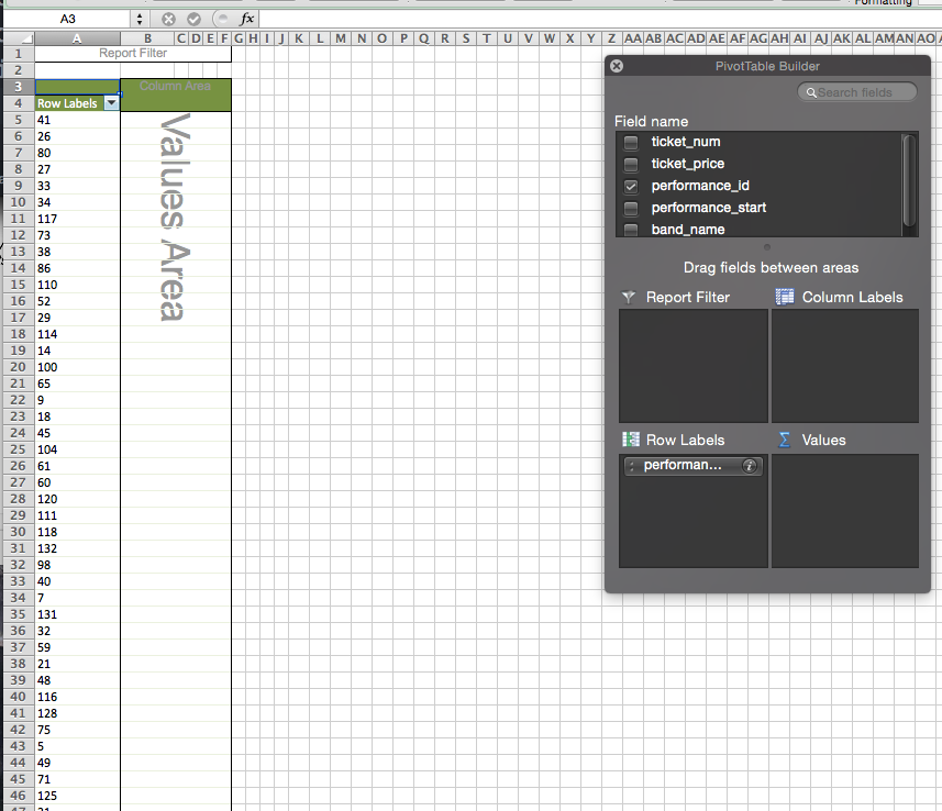
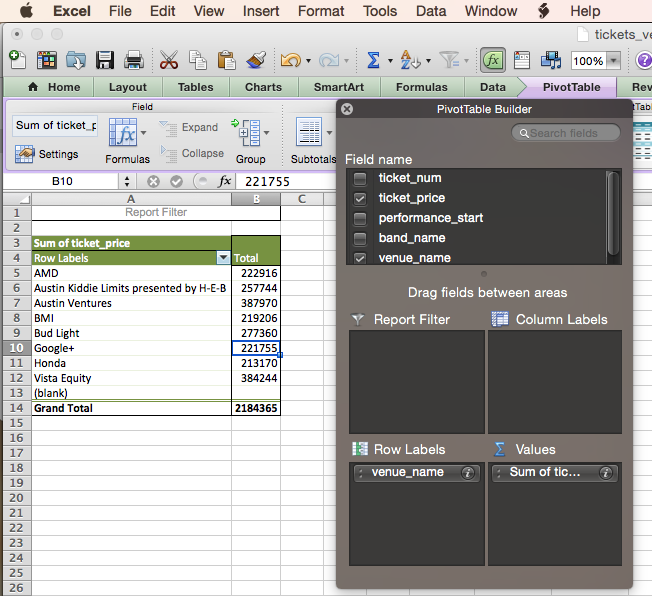
To replicate our SUM(tickets.price) part we drag ticket_price to the VALUES section. SUM is the default, so we will now see the addition of tickets.price for each performance (see that in the values area it reads “Sum of tic”). If you click on the i at the right of the part that you just dragged into the Values area you will see additional options (for me this part is abbreviated as Sum of tic). These are equivalent to the aggregate functions, so they include SUM but also AVERAGE, MIN, MAX. They also include COUNT which does the equivalent of COUNT(*). My version of Excel does not have a DISTINCT COUNT option, but later versions do.
Finally we want to ORDER BY the values, to bring those with higher revenue to the top. Again this differs in different versions of Excel. In my version of Excel I click in the column I want to sort by then choose Data -> Sort from the menu. This provides a number of options including sorting by Values (which is what we want) and Descending order.
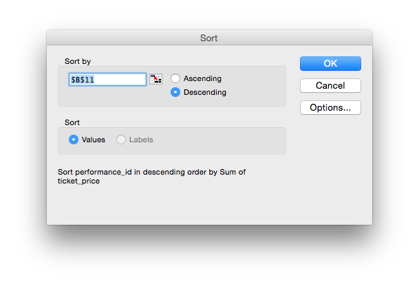
That brings performance 41 to the top, with revenue of $57,968.
Pivot tables using the Columns as well as rows.
Pivot tables are particularly useful for creating “cross-tabulation” displays familiar from tables in books. This “pivots” some grouping variables from the vertical/long layout to a horizontal/wide layout. I imagine this as a strip of paper representing the vertical groups, and sticking a pin in the top left, then rotating the bit of paper up. For me, that’s what the Pivot means.
For example let’s say we are interested in the popularity of different venues. And we’d like to break that down by different days.
We can do this in SQL using two grouping variables, but pivot tables make it possible to display that data in a more intuitive format, with one grouping variable for the rows and a different grouping variable for the columns.
Here’s the query in SQL, first joining over to venues.
-- get all tickets with band and venue data.
-- each row is a ticket.
SELECT *
FROM tickets
JOIN performances ON tickets.performance_id = performances.id
JOIN bands ON performances.band_id = bands.id
JOIN venues ON performances.venue_id = venues.id
-- Then sort by venue.
SELECT *
FROM tickets
JOIN performances ON tickets.performance_id = performances.id
JOIN bands ON performances.band_id = bands.id
JOIN venues ON performances.venue_id = venues.id
ORDER BY venues.name
-- And within venues, sort by the day of the performance.
SELECT *
FROM tickets
JOIN performances ON tickets.performance_id = performances.id
JOIN bands ON performances.band_id = bands.id
JOIN venues ON performances.venue_id = venues.id
ORDER BY venues.name, DAY(performances.start)
-- now convert the ORDER BY to GROUP BY and apply an aggregate function.
SELECT venues.name,
DAY(performances.start) as day_of_perf,
SUM(tickets.price) as revenue
FROM tickets
JOIN performances ON tickets.performance_id = performances.id
JOIN bands ON performances.band_id = bands.id
JOIN venues ON performances.venue_id = venues.id
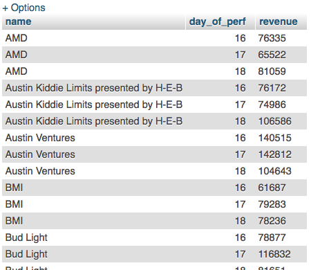
GROUP BY venues.name, DAY(performances.start)In the results we can see that the revenue for shows at “AMD” is now broken up by day.
It would be nice to see the day going “horizontally” and to be able to see totals for each venue for each day and the festival overall. We can get all those details using different queries in SQL but we can’t do it all at once and produce a nice display. Pivot tables help us here.
First we need to export the data from the JOIN, again using aliases to give us easy to interpret column names in Excel.
SELECT tickets.ticketnum AS "ticket_num",
       tickets.price AS "ticket_price",
       performances.start AS "performance_start",
       bands.name AS "band_name",
       venues.name as "venue_name"
FROM tickets
  JOIN performances ON tickets.performance_id = performances.id
  JOIN bands ON performances.band_id = bands.id
  JOIN venues ON performances.venue_id = venues.id
Download that export and rename “tickets_venues.csv”, open in Excel.
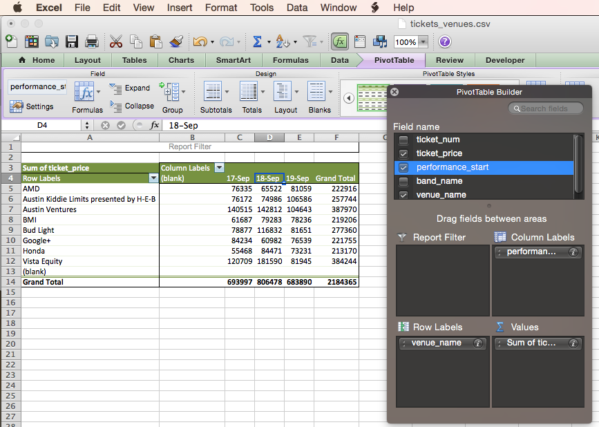
Set up a Pivot Table in a new worksheet:
And using the Pivot Table Builder, drag the venue_name column to the “Row Labels” square. You’ll see the distinct values show up there.
Then, as before, drag the ticket_price column to the “Values” square and set it to SUM (sometimes mine defaults to SUM sometimes to COUNT, if it is COUNT you have to scroll up to find SUM)
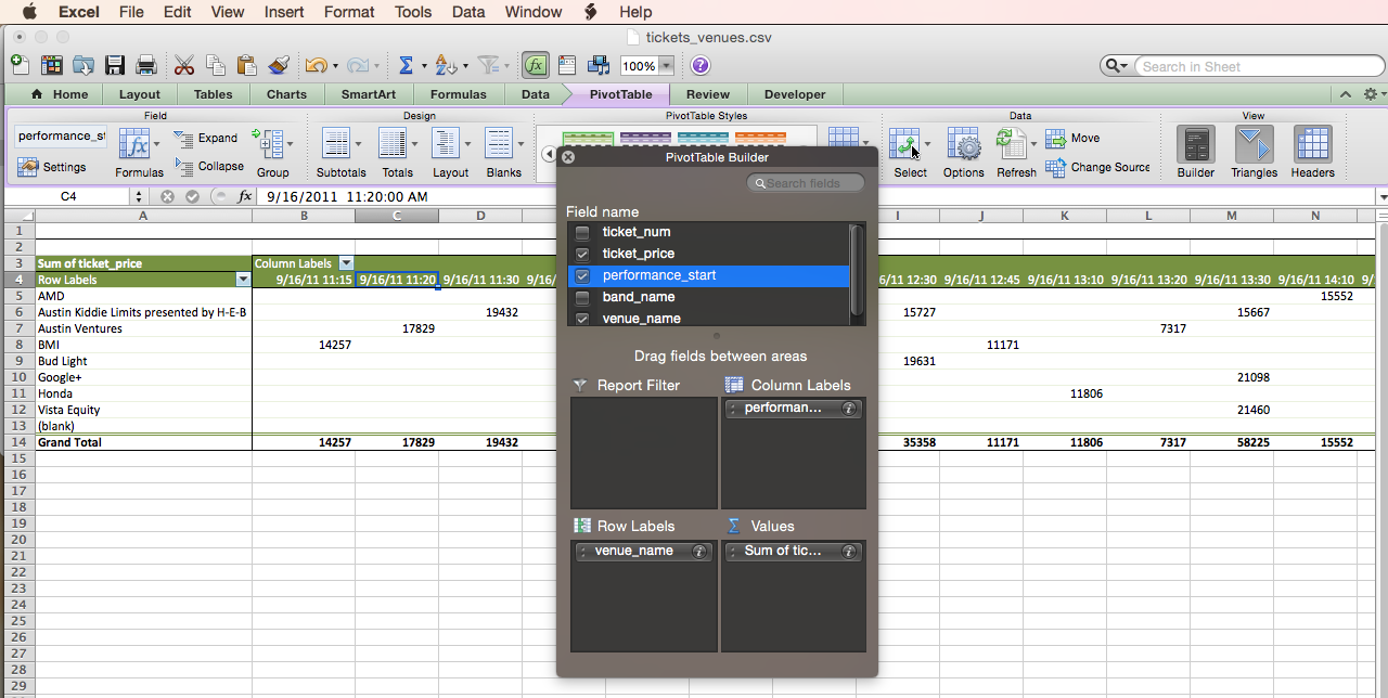
Now we have totals by venue, but we want to break things down further by day of the festival, equivalent to adding DAY(performances.start) to our GROUP BY. This requires two steps: first to break out the ticket sum by value of performances.start, then to apply the DAY function.
Drag performance_start to the Column Labels box. You’ll see that we get a column for each value of performance_start and the totals are now the sum of tickets.price for each show.
We want to do the equivalent of applying the DAY function. In Excel this is called “Grouping” and requires us to right-click on one of the dates, then chose “Group and Outline”, then “Group”.
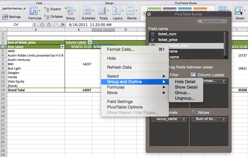
That brings up yet another window where we can choose to group our performance_start datetime by Day.
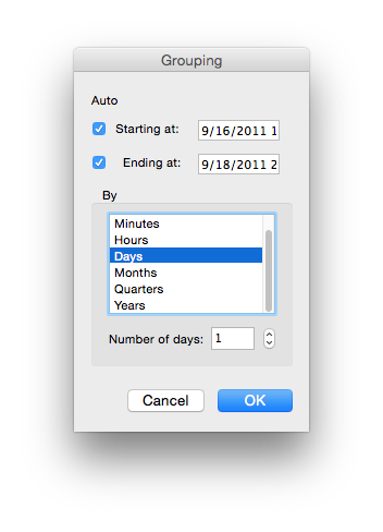
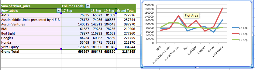
And now we can see our data grouped by two variables and broken out across rows and columns. We also get row totals and column totals and the grand total of revenue for the whole festival. Pretty nifty.
Notice the (blanks) on both the rows and columns? Those show up because I selected the whole sheet when creating the pivot table (I clicked the triangle in the top left). That means that there are some blank rows in the source data (even though there were not in the query results that we imported). To avoid that I re-created the pivot table with nothing selected on the tickets_venue.csv worksheet and that correctly found the range so that there were no blank rows included.
![]()
If we check back with our SQL version, you can see that the numbers produced are the same: the total price of tickets to shows at AMD on the 17th of Sept was $76,335. So the pivot table is displaying additional info (the grand totals) and a different format, but it is the same operation as GROUP BY
So that works for grouping by two variables, but what about going further? Pivot Tables enable us to have sub-categories on either the row or columns. You drag another column into the appropriate area. Here I’ve further broken down the revenue within each venue by band, and maintained the breakdown by day in the columns.
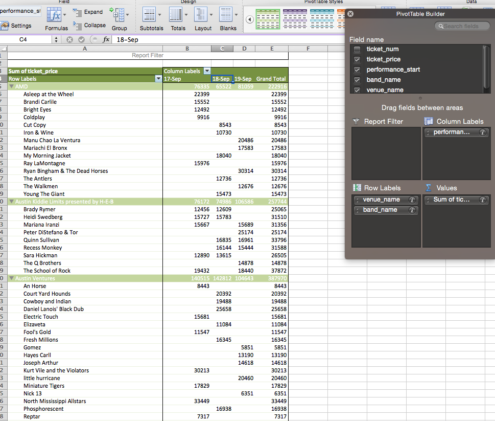
That is the equivalent of adding bands.name to the GROUP BY in SQL so that it reads GROUP BY venues.name, bands.name, DAY(performances.start).
Report filter
Finally we can do something like the WHERE clause to exclude some elements before grouping. In Excel this is called the “Report Filter” and it is the top right of the four boxes in the PivotTable Builder.
Here I’ve added band_name to the report filter and I could choose a single band or specify a few bands. This is often used to focus in on sales from a single store or region.
Final note: to remove a field from one of the four panes you drag it outside and release, it disappears in a puff of smoke.
Why Pivot?
Remember that I said the origins of Pivot Tables was lost in time? Well, the best explanation I’ve heard is that by applying different groupings you are “turning” or “rotating” your data to see it in different ways.
Incidentally this is the origin of the “cube” metaphor often used in “Business Intelligence” tools, see discussion on Wikipedia on OLAP Cubes.
Pivot is cooler, I guess. But who knows? In the end what matters is that Pivot Tables are how we do GROUP BY and aggregate functions in Excel.
Graphing results from pivot tables
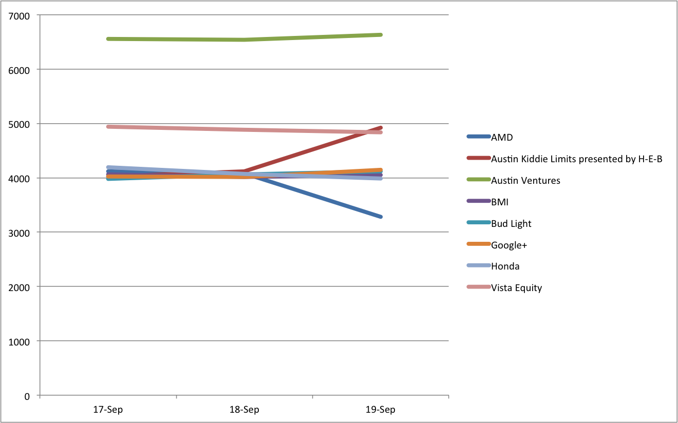
In later versions of Excel there is a feature called “Pivot Charts” which integrates the Pivot Table and creating a chart from it. Below, though, I cover using the results of a Pivot Table to build a chart. Our goal will be to see sales across venues by day.
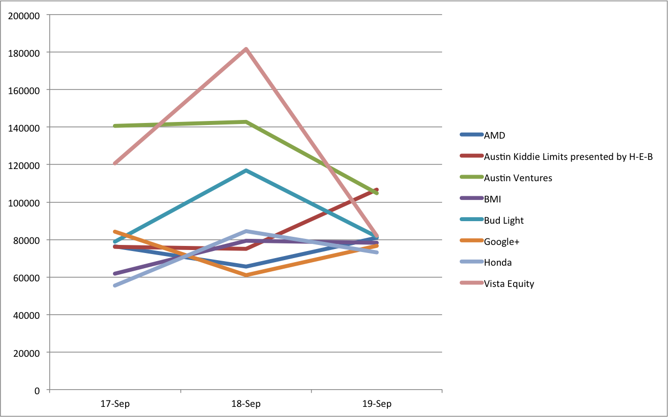
Here I selected the inner rows and columns (excluding the totals) and chose Insert -> Chart then chose the line graph from the set of options. By default this puts the row labels on the X axis and the column labels as the variables for the lines.
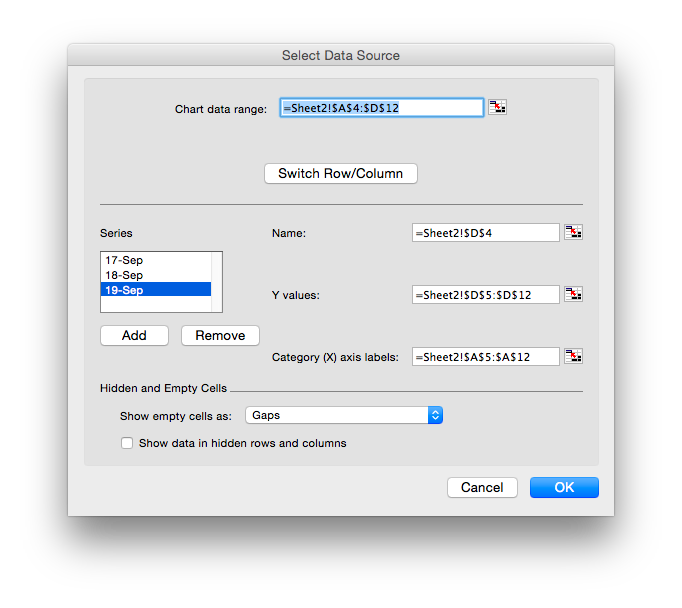
We can swap that around, so that we get the dates on the X axis (the natural place to see change over time) by right-clicking the chart and choosing Select Data. This brings up a window where our data for the charts is specified and that has a handy Switch Row/Column button.
From the image we can see that most venue’s revenue was stable but one venue had much reduced revenue on the third day.
This chart is still linked to the Pivot table, so we can make changes and have them reflected in the chart. I bring up the builder (on my version of Excel that’s on the right of the toolbar in a “View” area, although I often lose it). I can change the calculation from SUM to COUNT showing the number of tickets and resulting in this figure:
The linked graph is only watching the cells in the Pivot Table, so if you do something that changes the range (such as ungrouping the date) the graph doesn’t follow. Perhaps that sort of thing works better in the newer Pivot Chart feature.
Exercises
- Use an Excel Pivot Table to find the amount spent on tickets each month.
SELECT tickets.ticketnum,
       bands.name as "band_name",
       tickets.price as "ticket_price",
       purchases.date as "purchase_date",
       purchases.id as "purchase_id"
FROM tickets
  JOIN purchases ON tickets.purchase_id = purchases.id
  JOIN performances ON tickets.performance_id = performances.id
JOIN bands ON performances.band_id = bands.id- Graph that result (a single line)
- In a new Pivot Table worksheet, break purchases down by band as well.
- Graph that to see if any bands grew in popularity as time went on.
(This produces a line graph with a line for each band, too many lines to look at properly, there should be a way to filter by the value of Grand Total to only show the top 10 but I can’t get that to work, input welcome!)